Visualising Art & Inspiration in London College of Communication (UAL)
Type of Work
UX Research, Graphic Design
Client
University of the Arts London
Date
2025
Tools
Photoshop, Illustrator
Turning Raw Data into a Beautiful Poster
This project investigates how the physical display of art and inspiration affects student learning and engagement in the LCC library. The outcome is an infographic poster meant to help stakeholders planning the new LCC building.
Initial Research
I started with mind maps to identify every artefact in the library. From that I narrowed my focus to four areas: posters, pinboards, graphics and photos. These became the foundation of my observation sessions.

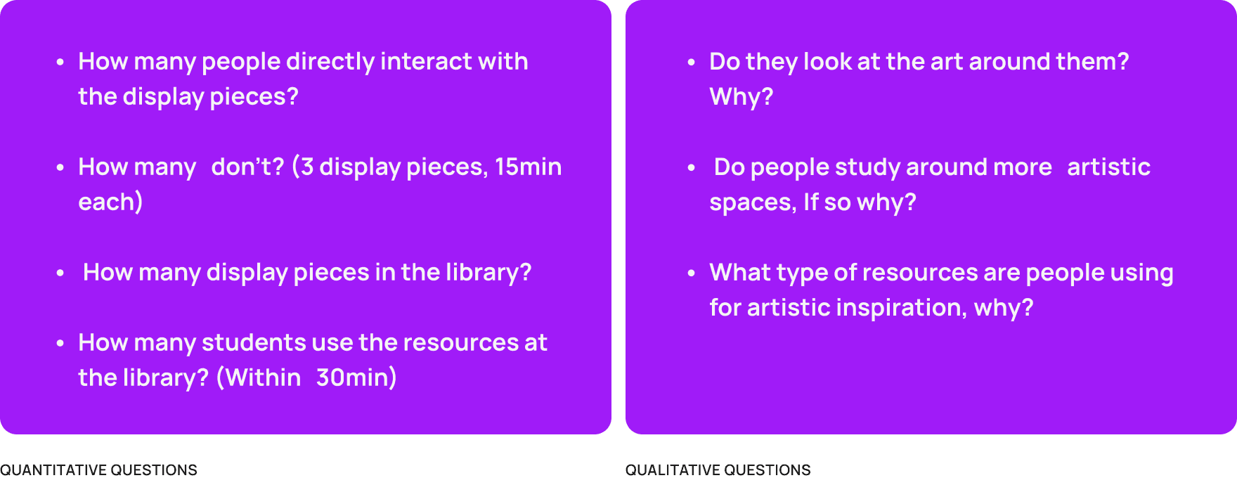
Questions to Answer
From then on I split my research questions into two tracks. Quantitative and Qualitative. This would allow me to get a better range of observations to conduct in order to get as much information from all different angles.
Carrying Out Observations
When carrying out observations, I sat near each area and quietly noted how people moved, what they looked at and how long for. Across the library main area, group study room, quiet study space and whiteboard library I observed over a 100 students. The main finding: most people don't engage with the art unless they're already interested.

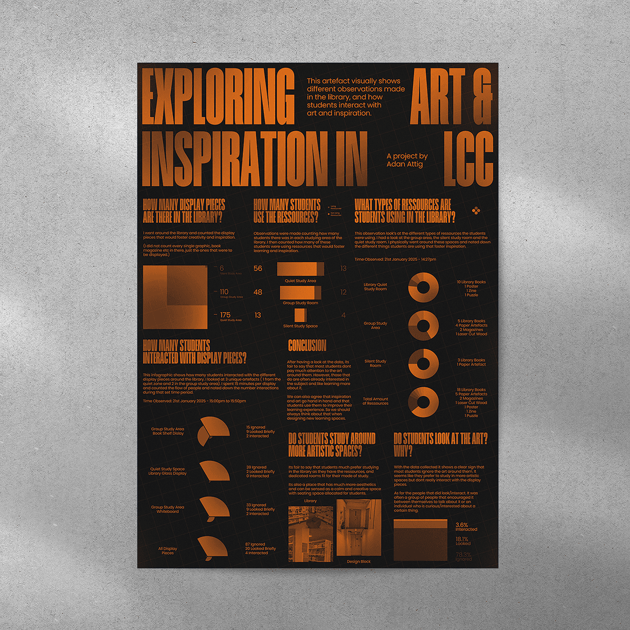
Synthesising Raw Data into Infographics
I took the raw notes and turned them into pie charts, bar graphs and comparative visuals. The goal was to make the findings readable for stakeholders who wouldn't want to sift through raw observation notes.

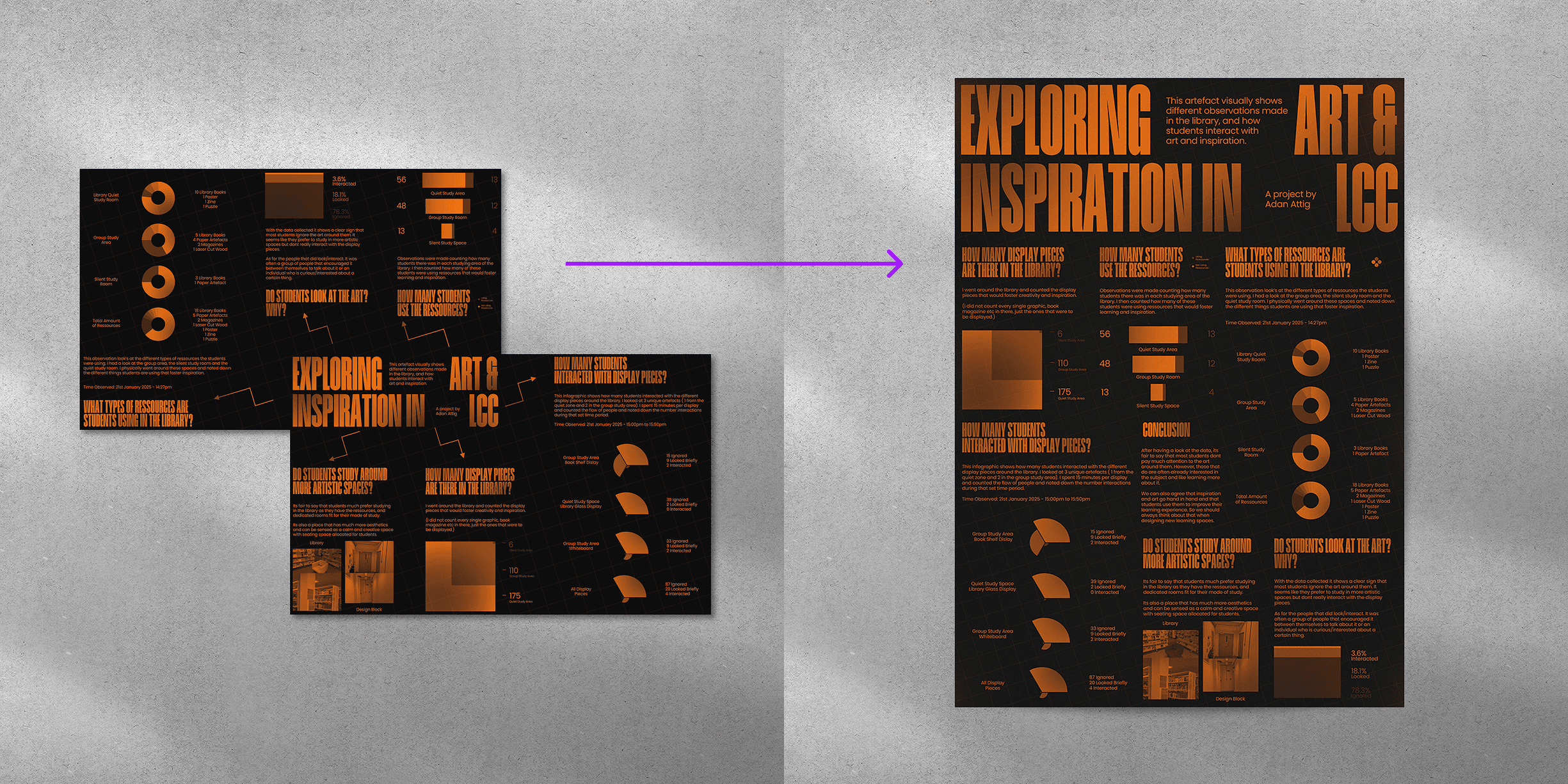
Poster Development
Using the infographics, I started sketching layouts and then moved to a digital software. Below you can see my ideations, the goal was to create a digestible layout while using black and orange to create contrast, overall making it as easy as possible for stakeholders to look at.

Change of Direction
While making the poster, my original idea was to create a create format in which two A4 pages were overlayed on each other. However, this idea was not suitable as printing it would involve extra labour by cutting out the blank space. Instead I opted for a classic A3 size that is easely printable.